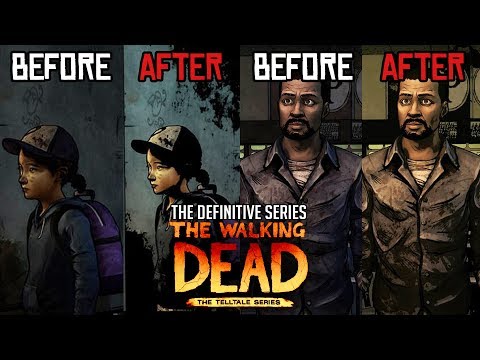
My thoughts definitive edition .
After watching Infernokun on leaks of those images of the newly improved graphic style art I am impressed what they did with both season 1 and season 2's lighting .
Season 1 when they show images of the Deugstore you can see sighns in the store much clearer then our current (Season1) but they didn’t model swap this time which I wasn’t expecting that.
Season 2 Also great lighting when they show images of the Cabin when Clementine was outside ready to sneak in.
Season 3 (ANF) on the other hands lighting was awful I mean really why did they saturate with all the Blue lighting that was terrible and Javier mixed with the blue lighting...
”YUCK!”
Not to mention the junkyard which was saturated with the diversity of different colors when you look at the crates in the junkyard (Again) same Blue lighting which ruined pretty much the focus and the surroundings of the area.
What do you Gus think?
Here’s the link bellow too see for yourself


Comments
They are not leaked images. Skybound posted it themselves on their twitter page.
What baffles more is that ANF already had a degree of filters that made things look browner than they actually are.
Guess they realized that and decided to put a lot of cyan to [over]compensate.
Javier looked like he was half Navi from James Cameron‘s Avatar.
Heh. That's another movie I never saw.
ANF only looks good with the original version, the colors gives it more life, compared to the graphic black in the new version.
Season 1 and 2, for me it's a combination of both old and new. Using the screenshot where Clementine was trying to get into the house for some first aid supplies.
They sky, yellow windows, and shed from the old. The house, trees, and Clementine from the new, combined them together and you'll get something awesome.
Imgur
Wake me up when someone announces a complete remaster of this game.
You’ll be sleeping for the rest of your life then.
The colors bleed way too much in the definitive editions.
Exactly, never.